Button
Buttons are the primary action triggers in EDS. They support direct actions (e.g., submit, confirm) and toggle selections, with variants to indicate hierarchy (contained, outlined, ghost) and intent (primary, secondary, danger). Always pair buttons with clear, action-oriented labels.
When to Use
Use a button for a direct, immediate user action (submit, confirm, start, cancel, toggle) rather than for pure navigation or passive information.
Use a button for direct, immediate actions (e.g., submit, confirm, cancel) or toggle selections (e.g., switching views). Avoid buttons for:
Structure
All variants support:
- Left/right icons (paired with text).
- Icon-only (requires an
aria-labelfor accessibility). - Text-only (default).
Toggle Buttons
Group related actions in a shared container where only one option can be ctive at a time. Use for:
- Switching views (e.g., "List" vs "Grid").
- Mutually exclusive options (e.g., "Day" vs "Week" in a calendar).
Density
- Default: Standard padding and typography.
- Compact: Reduced padding for dense UIs (e.g., toolbars). Must provide a way to switch to default mode for accessibility [1].
Hierarchy
Use variants to guide users to the most important action:
| Variant | Emphasis | Use Case |
|---|---|---|
| Contained | High | Primary actions (e.g., "Submit") |
| Outlined | Medium | Secondary actions (e.g., "Cancel") |
| Ghost | Low | Tertiary actions (e.g., toolbar icons) |
Communicate action criticality with color:
- Primary: Default (e.g., "Save").
- Secondary: Less prominent (e.g., "Save as draft").
- Danger: Destructive actions (e.g., "Delete"). Danger buttons must invert the order in button groups (e.g., ["Cancel" (primary), "Delete" (danger)]) to prevent accidental activation.
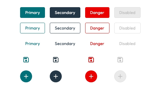
All variations can have the following: an icon on the left, an icon on the right, an icon with no text and text only with no icon. When using an icon, it must be directly related to the action and label of the button.
Accessibility
The aria-disabled attribute makes it possible to semantically disable the Button without hiding it from assistive technologies, such as screen readers. In EDS, the Button will be visually styled as disabled, but it is up to the developer to actually disable the button.
Standard Buttons
- Keyboard: Supports
Tabfocus; activates withEnterorSpace. - Disabled State:
- Use
aria-disabled="true"to semantically disable the button (visible to screen readers). - Developers must prevent clicks via
onClicklogic (EDS styles the button visually but does not block interactions).
- Use
Icon-Only Buttons
- Always provide an accessible name:
<Button aria-label="save report"<Icon data={save}></Icon></Button
- Avoid unless space is severely constrained (e.g., toolbars).
Toggle buttons
Toggle buttons allow users to select one of multiple options with a single click or tap. Only one option in a group of toggle buttons can be active at a time. Selecting one option deselects any other.
Guidelines
EDS has one set of primary toggle buttons with either an icon and no text, or text and no icon. When using an icon it must be directly related to the action of the button.
- Ensure only one option is selectable at a time.
- Label the group for screen readers using
aria-labeloraria-labelledby.
Accessibility
Toggle sets aria-pressed="bool" according to the button state. You should provide an accessible label with aria-label="label", aria-labelledby="id" or <label>.
- Group Labeling: Use
aria-labeloraria-labelledbyto describe the group’s purpose (e.g., "View options"). - State:
aria-pressed="true/false"reflects the toggle state.
Compact
Compact mode is toggled using EdsProvider.
The compact mode should come with the possibility to switch to normal mode for accessibility reasons.
Implementation in Figma
- In Figma go to the Assets Panel and search for button.
- Drag and drop the component in your frame.
- Rename and resize the component if needed.
- Choose the variant from the Design Panel.
Do's and don'ts
✅ Buttons in groups should always have the same colour except if one of the buttons is disabled. Try and be as consistent as possible throughout the app
✅ Use variants to differentiate hierarchy
✅ Danger buttons should always have an opposite order of what’s used in “positive” actions. This is used as an extra level of security in case the user acts with automatic choices. Therefore, if the user hits enter, the “cancel” button is pressed instead of “delete”
✅ You can use an icon to help clarify an action. Always use icons that clearly communicate their intended purpose
✅ Provide accessible names for icon-only buttons (aria-label).
✅ Allow switching from compact to default mode for accessibility.
❌ Do not apply the same colour to all the buttons in a group. Use variants (contained, outlined, ghost) to differentiate the hierarchy instead
❌ Do not use the same variant for all action buttons since the user needs to understand which call to action has the most emphasis
❌ Do not wrap text over multiple lines. Scale the width to make the text fit on one line. Don´t adjust the height of the button
❌ Do not assign the same order to danger buttons as the “positive” action button groups (primary + secondary), use the opposite (secondary + primary) instead
❌ Do not use an icon that can mislead the main action
❌ Do not rely on color alone to convey meaning (ensure text/icons are clear).
❌ Do not disable buttons without explanation (e.g., add a tooltip for "Why is this disabled?").