Autocomplete
The autocomplete (previously called select) component allows users to choose one or multiple items or options from a list.
When to Use
A select can be used in different settings:
- to filter or sort content on a page
- to submit data
Structure
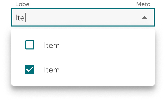
- Autocomplete
- Autocomplete multi

Guidelines
The autocomplete variant is used to choose only one option from a list. The autocomplete multi variant is used if multiple choices can be applied.
A native select component is also available for implementation. We recommend using native autocomplete on products with limited space as it provides a better user experience.
Accessibility
The property label is mandatory and makes sure you have a descriptive label for screen readers.
Implementation in Figma
- In Figma go to the Assets Panel and search for autocomplete
- Drag and drop the component in your frame
- Rename and resize the component if needed
- Choose the variant from the Design Panel.