Introduction
The EDS colour foundation provides a clear, consistent, and accessible way to use colour across Equinor’s digital products.
It is built on semantic colours, named and organised by their role and purpose in the interface rather than by how they look.
This means you choose colours based on function, not shade.
It helps designers and developers speak the same language, keeps interfaces consistent, and makes it clear when and where to use each colour.
Accessibility is a core principle of the system, ensuring readable and inclusive colour combinations across both light and dark modes.
Colour scheme
The colour foundation supports both light and dark schemes, helping you create clear hierarchy and accessible interfaces in any mode.
Instead of a traditional linear scale from light to dark, each EDS colour scale is built with intentional steps in lightness where each colour step is chosen for a specific purpose.
The steps jump rather than blend, creating clear contrast between key pairings such as text and background.
This step-based approach ensures that every combination has the right visual separation and contrast built in.
Each step also keeps the same lightness level across all colour categories.
This means the relationship between colours stay consistent even when the hue changes.
| Light | Dark |
|---|---|
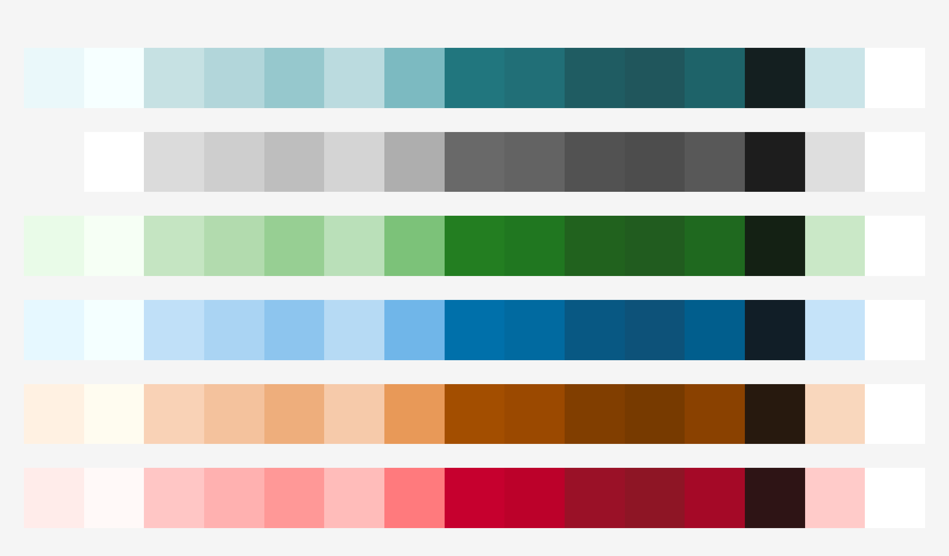 | 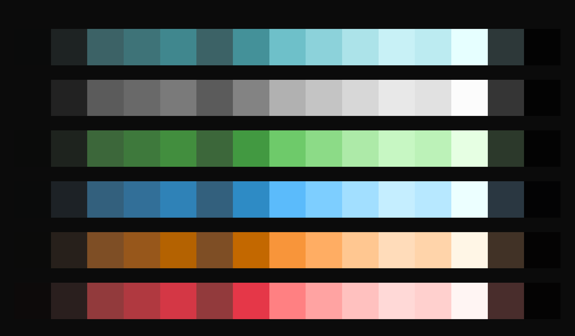 |
Note: We generate all colours using our colour palette generator. This tool ensures consistency and helps maintain accessibility standards.
How it’s structured
Each colour belongs to a semantic category that reflects its purpose in the interface.
The system includes six main categories:
- Accent – brand and highlight colours
- Neutral – base and supporting colours
- Info – communication and neutral messages
- Success – positive or confirming feedback
- Warning – cautionary states
- Danger – destructive or error states
Each category includes colours for:
- Background (bg)
- Border
- Text
These groups define the usage areas of the colours. For example, colours in the Text group are designed specifically for text and icons, ensuring the right contrast and readability.
Background
Background colours create the foundation of your interface. They define layers and ensure text remains readable.
Roles:
- Canvas – main application background
- Surface – placed on canvas to create depth in layouts
Background Fill
For interactive elements like buttons:
- Muted – subtle, less prominent
- Emphasis – bold, more prominent
Background fills include default, hover, and active state variants.
Borders
Borders separate content and add structure. They organise information and guide focus.
Roles:
- Subtle – light separators and dividers
- Medium – standard borders and controls
- Strong – emphasis or interactive elements
Text
Text colours ensure content is readable and create clear hierarchy.
Roles:
-
Strong – primary text in your application
-
Subtle – secondary text and less important content
-
Strong-on-emphasis – text on emphasis backgrounds
-
Subtle-on-emphasis – secondary text on emphasis backgrounds
-
Background: base layers and surfaces
-
Background Fill (Muted / Emphasis): used for interactive elements such as buttons and selected states
-
Border: outlines and separators
-
Text: text and icons
Concepts (global roles)
In addition to the semantic categories, EDS includes a Concept collection for global colours that sit outside the scales. The Concept collection covers cases where it does not make sense to have one colour per scale.
Concept colours include:
- bg-floating – floating elements like tooltips and menus
- bg-backdrop – overlay layer behind modals
- bg-input – input fields and forms
- border-focus – focus rings for accessibility
- text-link – default link colour
These concept colours complement the semantic system and ensure consistent handling of global interface elements.
Accessibility built in
Accessibility is not an afterthought; it is at the core of the EDS colour foundation.
Each colour combination has been evaluated using the APCA contrast algorithm to ensure readability and harmony across all modes.
APCA models how the human eye perceives contrast and brightness more accurately than older contrast formulas, giving a truer picture of real-world legibility.
Features
The colour system includes built-in features for accessible, consistent interfaces:
- Accessible by design – Uses APCA contrast algorithm to model human vision and ensure reliable readability
- Light and dark themes – Switch themes by applying a
data-colour-scheme=["light" | "dark"]attribute. - Purpose-built – Every colour has a defined role in the interface
- Reliable contrast – Text colours always meet contrast targets against matching backgrounds