Getting Started
The EDS colour foundation can be used in two ways through a static or dynamic approach.
They share the same colour values and accessibility logic but differ in how colours are applied and managed.
Choose one approach and use it consistently across design and development.
Using different approaches causes design and code to drift apart, making development harder. Each Figma variable has a matching code variable, keep them aligned.
Static: Each semantic category (accent, neutral, info, success, warning, danger) has its own variable.
Dynamic: Uses abstraction with variable mode in Figma and data attribute in code to define semantic category
Note: The variable mode in Figma and data attribute in code are foundational colour tools. They don't replace component properties or variants. Continue creating component variants using component properties as usual — these colour tools work alongside your existing component structure.
For Developers
Install the EDS tokens package:
pnpm install @equinor/eds-tokens
Tutorials
We've made a set of tutorials explaining how to use the static and dynamic colour approaches:
Static Approach
Import the static variables:
@import '@equinor/eds-tokens/css/variables';
Use specific semantic variables:
.button-primary {
  background-color: var(--eds-color-bg-accent-emphasis);
  color: var(--eds-color-text-accent-strong-on-emphasis);
}
Dynamic Approach
Import the dynamic variables:
@import '@equinor/eds-tokens/css/variables';
Set the semantic category using the data-color-appearance attribute with any of these values:
neutral(default)accentsuccessinfowarningdanger
<button data-color-appearance="accent">Continue</button>
Use abstract variables:
.button {
  background: var(--eds-color-bg-emphasis);
  color: var(--eds-color-text-strong-on-emphasis);
}
Colour Scheme Detection
By default, the colour system detects light and dark colour schemes using the data-color-scheme attribute:
<!-- Light theme (default) -->
<html data-color-scheme="light"></html>
<!-- Dark theme -->
<html data-color-scheme="dark"></html>
Custom selectors: Extend this by defining your own selectors. For example, use .light and .dark classes:
/* Override default colour scheme detection */
.light {
  color-scheme: light;
}

.dark {
  color-scheme: dark;
}
Then use classes instead of data attributes:
<!-- Light theme -->
<html class="light"></html>
<!-- Dark theme -->
<html class="dark"></html>
For Designers
You can use the EDS colour system in Figma with either static or dynamic variables. Both options are available as shared libraries, just make sure you and your developers agree on which approach to use.
Tutorials
We've made a set of tutorials explaining how to use the static and dynamic colour libraries in Figma:
Tutorial - Static library in Figma
Tutorial - Dynamic library in Figma
Static Approach
Add the EDS Colours (static) library to your Figma file to use static variables. These are organised by category, so you can easily pick the colour you need. The static approach lets you choose from all colours, selecting the exact shade you want for each element.
Example: Primary button (static)
- Select your button in Figma.
- Apply these variables:
- Background:
Bg/Accent/Fill Emphasis/Default - Text:
Text/Accent/Strong on Emphasis
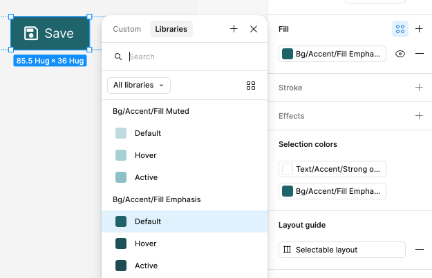
The primary button uses Bg/Accent/Fill Emphasis/Default for its background and Text/Accent/Strong on Emphasis for its text colour.
Dynamic Approach
Add the EDS Colours (dynamic) library to your Figma file to access dynamic variables.
In the dynamic library, you only see roles such as Background, Text, and Border.
You apply these first, then choose the appearance (the colour category) using modes in the Appearance panel. With the dynamic approach, you focus on contrast first, then select the colour or appearance that fits your context.
Example: Primary button (dynamic)
- Select your button in Figma.
- Apply these variables:
- Background:
Bg/Fill/Emphasis - Text:
Text/Strong on Emphasis
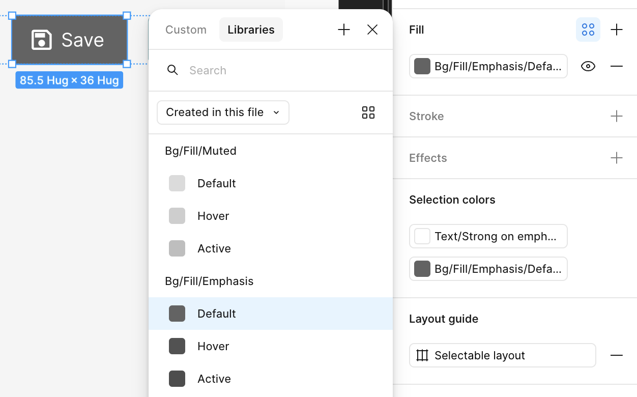
The primary button uses Bg/Fill/Emphasis for its background and Text/Strong on Emphasis for its text colour.
3. Open the Appearance menu and chooseAccent.
You can change the button’s appearance at any time without updating the roles.
To change appearance:
- Select the button.
- In the Variables panel, open the Appearance dropdown.
- Choose Neutral, Accent, Info, Success, Warning, or Danger.
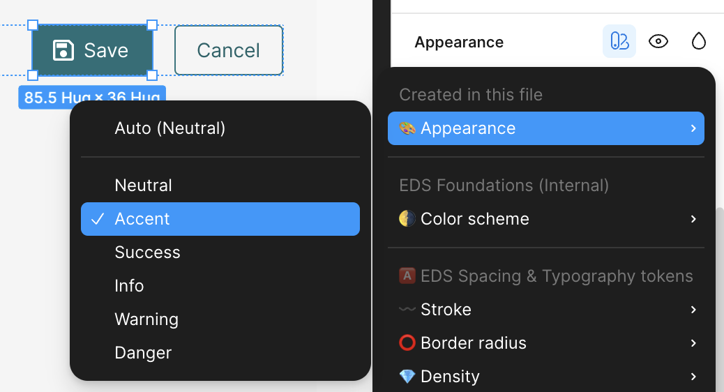
Change the appearance using the dropdown in the Variables panel.
Light and Dark Colour Scheme
Both the static and dynamic libraries support light and dark modes.
Switch between them in the Variables panel, and your design updates automatically with the correct colour values and contrast.