Product Icons
Product icons represent key themes and business areas with Equinor's visual identity. They help users identify and navigate between different products and services whilst maintaining consistent brand recognition.
When to Use Product Icons
Use product icons in app launchers, splash screens, and product identification contexts. Always pair them with the product name they represent to ensure clear communication and brand consistency.
Technical Specifications
- Grid system: Built on a 48x48px grid for consistency
- Scaling: Can scale up but not down from the base grid
- Style: Simple, geometric outlines following Equinor brand guidelines
- Stroke weight: Consistent 1px throughout all elements
- Corners: 1px rounded corners to reflect brand identity
Usage Guidelines
Do
- Use product icons with the product name they represent
- Maintain the 48px minimum size for clarity
- Follow the established grid system for consistency
- Keep designs minimal, geometric, and symmetrical
Don't
- Use product icons as system icons or for decoration
- Scale product icons below their base grid size
- Use product icons for marketing purposes
- Create filled versions (always use outlines)
Exceptions
Optical corrections are not allowed in product icons.
Using Product Icons in Figma
- Open the Assets tab in the Layers Panel
- Search for specific icons using the search bar or browse through organised folders
- Drag the icon component into your frame or artboard
- Hold Shift when resizing to maintain aspect ratio
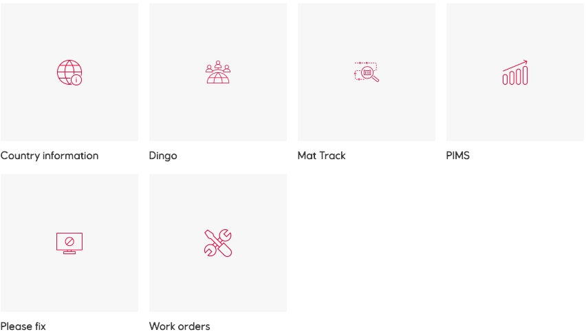
Library
Generic

Placeholder product icon
Mobility
Contributing New Product Icons
Missing a product icon for your project? You can contribute new icons following our brand guidelines.
Before You Start
- Search thoroughly using all relevant keywords to ensure the icon doesn't already exist
- Consider reusing existing icons when appropriate
- Ensure your icon will be universally understandable across languages and cultures
Design Requirements
Visual Style
- Use simple, single-colour keylines only
- Apply 1px rounded corners throughout (reflecting the Equinor logo)
- Maintain 1px consistent stroke weight for all elements
- Keep designs facing forward, never rotated or dimensional
- Limit complexity to maximum three objects
Technical Standards
- Create outline-only icons (no filled versions)
- Avoid multiple stroke weights or square corners
- No hands holding objects or overly complex details
- Maintain bold, geometric, and symmetrical designs
Creating Your Icon
-
Set up your workspace
- Create a 48x48px artboard
- Add the Product icon grid from the Assets File Utilities page
- Lock the grid layer and select your preferred grid shape
-
Design your icon
- Align all artwork to the pixel grid
- Avoid centre borders (they create half pixels)
- If using borders or line tools, outline (expand) your work before submission
-
Prepare for submission
- Remove and unlock the grid layer
- Ensure the icon isn't grouped or nested
- Name all layers logically
- Use descriptive, searchable names for your icon
Submitting Your Icon
When your icon is ready:
- Choose an appropriate category from existing library categories
- Provide alternative names people might search for
- Contact the EDS core team designers for guidance and submission